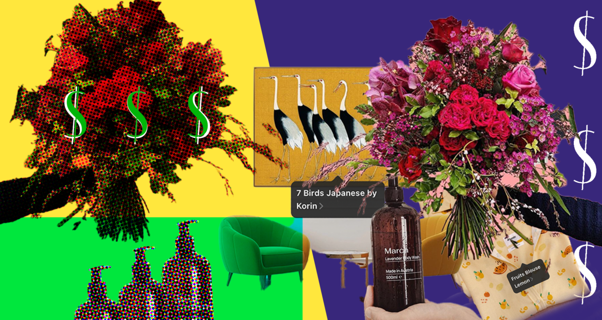
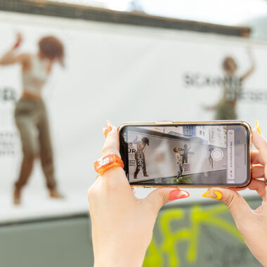
While nobody can 100% predict if ad creatives will hit the sweet spot with their target audiences, there are techniques you can use that will increase your chances of engaging the crowd you’re aiming to sell to.
Instagram is a fantastic channel to sell your products or services on, but it isn’t a simple game to play. You have to capture attention in 2 seconds (the average attention span for a post), while cramming what ever you want to tell your audience about your product or service into a small rectanglular box.
We’ve spent countless hours refining our Instagram ads craft, with proven results coming out the other end that has made our clients hundreds of thousands of Euros.
So, we thought we’d share with you some of the Instagram content and ads that have been demanding attention in 2022 and sparking that instinct in us to buy stuff.
And most importantly, we also pick apart why they work.
Plus, as we know Austria has it’s own specific kind of audiences, we’ve selected the content from companies selling to Austrian audiences on Instagram.
Oh, and never underestimate your creative in an ad campaign. Seems obvious, yet a lot of marketing pros do.
Keep it simple…and bold and beautiful
View this post on Instagram
Secret sauce: The premium Vienna-based hatmaker, Nomade Moderne, are doing a quality job in producing eye-grabbing content on Instagran – just check out their Reels.
It helps that what they’re selling is damn beautiful, however, they’re also proving in every post that they have what it takes to present their beautiful products, beautifully.
The example above has the perfect mix of eye-grabbing bright and bold colours, while the viewer also immediately knows what you’re trying to sell them.
The centre framing of the product is a basic, age-old photography trick that still works like a charm – especially in Instagram ads – to focus the viewer’s attention.
Be sure to think about your background as much as you think about how your product is going to look.
View this post on Instagram
This florist in Vienna is changing the game when it comes to posting content that sells on their Instagram channel.
Their recipe is simple – put their big and beautiful bouquets of flowers in settings that accentuate and bring out the best in the products that they’re selling.
Colour and subtle animation attract
View this post on Instagram
Secret sauce: The premium printers, MOO, makes merch’ and in 2022 they popped up in Austrian Instagram feeds in a big way with this simple ad above.
Colour is a tool that you can play with to capture your audiences attention. Here, they capture your attention by using as a background the one plain blanket forest green colour of the product being sold, while animating the bottle ever so slightly. This makes for one very effective, eye-grabbing ad.
And once again, the product is in centre frame and the rest of the frame contains no distractions to divert attention away from the product.
Make them imagine it in their lives
View this post on Instagram
Secret sauce: This is a Berlin-based poster manufacturing operation and it’s got Instagram Shopping at the centre of its sales strategy it seems.
If you haven’t had them in your Instagram feed yet, we’d be surprised. Anyhow, the Instagram ad creatives here are effective for a couple of reasons:
a.) they frame the product being sold in a way that draws your attention directly towards it
b.) they’ve placed the product in a living room space which inspires the user to do the same in their heads. They help the user imagine the poster in a real life space.
View this post on Instagram
View this post on Instagram
One of the things that makes this 7th district Viennese concept store so well known is exactly the same thing that makes you want to buy everything in their store: they have a sharp eye, and they know how to present products in a desirable way. They also have skills with the camera, which helps. Die Sellerie also often pictures products in real life settings; this helps you imagine the products in your life.
Add texture
View this post on Instagram
Secret sauce: Why is there a spilled bag of lemons invading the bottom left hand corner of this ad creative selling a bold print outfit?
Well, of course the lemons relate to the motif on the outfit, BUT what makes this bag of lemons clever is that it adds texture to the image that does things to our brain. Lemons make us think of freshness and bright, positive vibes.
Adding texture to your ad creatives does wonders in making it more impactful and memorable with its audience. Our mind is attracted to texture.
You can also see that their caption elaborates on the texture built into the image.
Drop the glossy look and make it relatable
View this post on Instagram
View this post on Instagram
Secret sauce: The vintage clothing online marketplace, depop, knows what they’re doing when it comes to selling on Instagram.
Most of their posts are all about featuring their sellers in unpolished, unstaged photography wearing the clothes that you can pick up on the platform.
They’ve thought of their audience when deciding to post ads featuring this kind of photography that a user could imagine taking themselves (an authentic aesthetic that young target audiences buying vintage are drawn to).
Besides their unique visual language being on point, they are also hyper-specific when giving you an impression on what you can buy on the other side of the ‘view shop’ link.
They feature sellers wearing the clothes they’re selling on the platform.
This leads to more sales as the sales leads you get coming your way are high quality.
Present your products in an unexpected way
View this post on Instagram
Secret sauce: The original fashion label to bring the best of Viennese out on a shirt, Kitschbitsch, has built a cult following in Vienna and their Instagram ads are as on point as their designs are.
This ad creative above is a perfect example of a very clickable ad and there are two things contributing to this in the creative.
- They present their shirts in an unexpected way – most accounts selling such fashion will present their shirts in a flat lay shot, or on a model or hanging from a coat hanger so the viewer can see the entire shirt. But this original approach seen above puts into the focus the biggest selling point for Kitschbitch – the hyper-Viennese phrases featured on the shirts.
- The imperfections of the studio photo adds originality. The background paper curled in the top left and the perspective of the shot that reveals the studio setup with the background paper – these details make for a beautifully executed twist to what could have been just another photo shot in a studio.
People, testimonials and proof of why I should buy it
This ad creative from clickcease is all the right kinds of right when it comes to an attention-grabbing video when it comes to it’s target audience.
It begins by telling you the benefit of using the tool, follows up with a testimonial that speaks directly to its target audience. It then tells us that it’s free.
Despite that your instinct may tell you to do so, don’t go spending the first 20 seconds of your video ad telling us what your product or service is. Rather, tell me the things that will spark my interest, or better yet, my desire.
Think of it like a news article – give me a headline first, hook me in the next line and expand with the explanation from there.
The fast cuts and quick animated elements also work well in keeping my attention until the end.


